Thursday 27 September 2012

Modeling Just Sucks

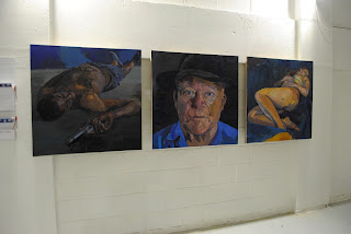
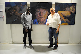
That was a quote from Handsome Boy Modeling School, and this is a bit of a different post from me. Unlike the vast majority of posts I've put out this work wasn't done by me however, it did end up there being a painting of me hung in an exhibition, so I thought I'd fill you in on the details.


On my last post about "We're Better Together" t-shirts I mentioned that I'd got in contact with my secondary school's art department for advice on how to get started with screen prints, and I was kindly allowed to use their facilities. After setting up the screens, and waiting on them to dry out my former teacher, Karen Plummer, mentioned that she was coming to the end of completing her MA in Art Teaching at Goldsmiths, and wanted my opinion on some photographs she'd taken, for one of her final pieces, with a model. She'd not been completely happy with them as the model she'd hired was unable to do the poses she wanted properly, due to being ridiculously HENCH, so in turn a bit less flexible.

For what it was worth, as a bit of a throw away comment I stated that if she wasn't happy with the model then it would affect the overall work and probably shouldn't persevere with him.
It was at this point she turned to me.

"Do you want to do it?"
"Erm. Don't think I'm the modelling type"
"Are you sure, I'd pay you the modelling fee"
"Erm, ok, I suppose I could try"

Let that be a note to all those looking for creative workers... I'm pretty maleable.

So that's how it started off.
Over, roughly, seven weeks, I posed for the painting for between 2-3 hours periods. Anyone who has had their picture drawn, and asked to be still for any length of time knows its very difficult not to be distracted. Fortunately, I was meant to be dead in the painting so it meant that I'd be laying down. While this was a lot easier than, I presume, having to hold a standing pose would be it still had its challenges. The positioning of my arms and, to a lesser extent, my legs meant that my body was at an slightly awkward angle and not fully relaxed. My body weight was held on my left side, and with my shoulder tensed it meant that I had to concentrate on the position, as well as the ability to block out the incremental feelings of pain and numbness in the arm and neck.
I would start off being able to hold the pose for anything from 45 minutes to an hour, but after succumbing to the pain on the first occasion it felt like I had less resistance to it, and could hold the position for much less time.

While the majority of the piece was done from live modelling, there were portions that were done from photographs, mainly due to time constraints on both parts. I can't comment on how that would have affected this piece but, from my own experience, a photograph often gives a distorted view of the forn and tonal scale of the subject matter. This seems somewhat perverse, as a photo is a snapshot from a moment in time but I believe that drawing from life is far more of an informative method of working. One could draw an analogy of watch a sporting event on television as opposed to seeing it live. The visual experience is not the same, and in both cases you can only see what the camera is telling you to see.

So far I've spoken a lot about my own experience, so here is a quote from the artist describing the overall theme of the work:
"My ontological understanding is grounded within my artistic practice in a continual exploration of meaning through the use of visual enquiry, scrutiny and recording. The artwork I create is autobiographical: it concerns looking, viewing, deconstructing and subsequently reconstructing. I perceive this as a becoming creative process, planting affective structures of reference, which are rooted in the process of praxis in order to, identify, develop, highlight, and implement the emergence of change and to transform reality.  My preferred subject matter, which, has continued to be a major preoccupation is the human form and one where difference can be celebrated.   My most recent work, a triptych of paintings, are characteristic of the way in which I work in that they are figuratively drawn from life. The work is realised through the liberation of line and colour and expressed through the language of paint. I view them as an exploratory set of paintings that combine the dialogical tension between self, other, the life of the materials and in their conversation with each other. Identity is a key theme to this body of work, which concerns the notions of self-representation, difference, stereotype and self-discovery. The images were constructed through a process of recording with sensations, mark-making and colour; a lateral mode of creating and. Appearances and sensations were recorded and built up as an intuitive, emotional response to what Bacon referred to as the ‘mystery of appearance’. The brush served as an extension of my hand and arm to my mind’s subconscious imagination in order to unlock and reveal. In this way, I have used my materials as a language vehicle for creating images; ‘trapping’ and ‘unlocking’ in order to ‘draw out’ a  ‘realisation’ that makes sense of the world, to deconstruct and re-territorialise it by using non-linguistic forms of communication." 


Images taken at the Goldsmiths MAAT Private View, 03/09/12.


Once finished the painting was displayed in an exhibition held by Goldsmiths, at St. James Church. There, I was introduced to Graham, who Karen had begun painting at roughly the same time as myself.   In the week leading up to the exhibition I was due to pose for a final time but were unable to schedule a time, so the first time I saw the finished article was hanging in the gallery. Despite having seen it develop over several weeks it was a rather surreal experience to be in a room with the painting, with other people who would have been viewing it for the first time.
On a brief note, this was a rather poignant venue, as I'd attended primary school only metres away from the gallery space and Karen had attended Goldsmiths at undergraduate level, so it was a homecoming of sorts for both of us. 
Overall, it was definitely a new experience that I wouldn't necessarily be adverse to but, I think my forté lies as the creator rather than the subject matter. 


One last Handsome Boy Modeling School reference...

Tuesday 21 August 2012

Bit of a spruce

As most of you will have noticed, I have created a accounts on Twitter, and Facebook respectively so I thought I'd give them bios a bit more of an in-depth feel. 

Ok, I nicked a bit from Jack Lowson ...What? Don't give me that look. His surname sounded similar. Good artists borrow, and all that. 

Hopefully it all sounds a bit more connected and competent now.


Thursday 19 July 2012

Teenage Mutant Ninja Turtle

For those of you wondering about the title, I'll take it that you didn't read the initial post about the t-shirts, and for that shame on you.
Yes, you.
I know who you are.

For those of you who've just had a hearty chuckle, due to remembering the Officer Barbrady reference I made before, welcome back.

It's been just over 7 weeks since I thought of making a little doodle into a piece of free advertising, and I'm glad to say it's finally come to fruition. So here's how it all happened

You may have noticed that often my work draws inspiration from film, sport or other strands of pop-culture, and this occassion followed that trend. A friend at work had mentioned the Jack Johnson song "Better Together", and I began to think of the world's great double acts, Petit and Vieira, Bert and Ernie, Bangers and Mash etc, but then I got a bit hungry, and moved on.
The next day, on a train journey to work the idea from the day before flashed into my head, and I could vividly see tea and biscuits as a cute couple, so I knocked out a quick sketch, and it just seemed to fit. Perhaps the food theme had stuck in my head, subconsciously.

Power couple

I thought that from this doodle I could come up with a quick animated sketch, and possibly do some sort of promotion around it. For those of you that know me, I love clothes, and had a bit of experience screen printing, so everything seemed to fall into place.

Layout phase
I contacted my secondary school's art department for a bit advice on how to set up a screen print, and they graciously offered their facilities. I headed over with my sketchbook and spoke about how I planned to layout the design, and once that was settled, photocopied it. Sizing was a bit of a problem for me, as I wasn't sure how the design would finally look until the print was done, so after a bit of guesswork we blew up the image by 180% onto acetate for it to be laid onto the pre-prepared silkscreen. I must give thanks to Karen Plummer and Graham Sayle for their help on setting up the equipment, as my printing skills are somewhat rusty, having not been put to use for about 10 years.


After a good 5 minutes of shining a bright lamp onto the image, I was almost ready to go but I had to ensure that only the necessary areas of the screen would allow the ink through, so started covering the borders and any gaps with brown tape, and left it to dry over night.
Silkscreen

Coming back to the screen today, with it having dried out overnight, I decided to test the print out on a pair of vests, some t-shirts and a tote bag. I used black textile printing ink, that I picked up from Cass Art. I put a couple of sheets of newsprint inside each item, in case the ink pressed through to the other side of the fabric, and then applied the ink with a squeegee. I let them dry for about 20 minutes, took them home and ironed on the reverse of the design.

Pretty straightforward stuff, really.

Here are the end results

Hot off the press


L to R: Vest, T-shirt, Bag
Like the handwriting?

I think the first batch came out fairly well, but I've already realised what I want to do to tweak them. Mainly to do with the positioning of the design, and how much pressure to apply with the squeegee (I love that word).


These were intended for my own use. but I've had one or two of you guys ask, so if enough people are interested, I'd consider making a couple extra to sell on, but I'd need to know by Saturday, as I'm printing again on Sunday.


Let me know what you think of them, here in the blog, or on my new Facebook page, or Twitter feed. I'm all over the place.

@KarlDrawsStuff


 Karl(DrawsStuff). x


Thursday 28 June 2012

Mumette

Now this is a story all about how my life got flip turned...
No wait! ...Neither the time, nor place.

This is a post about my work with Mumette, so pull up a chair, put on your reading glasses and take it all in

The story begins at a mutual friends birthday party, and allowing me near a laptop with WiFi. I was initially tasked with song collection, but decided to show Sundae Afternoon to a new, and captive audience. I ended up Bookmarking the page and the night continued without much further talk of animation.

A few weeks later I received a message from said mutual friend telling me that the owner of the laptop, Emma, had been looking for someone to assist her with some illustrative work for a website, and my name had come up in conversation. This coupled with the blog site being saved on her Macbook made me a pretty accessible option.
A few more weeks followed, and on a late winter evening, over some hot chocolate *standard*, Emma told me what about the Mumette project.
I doubt I can do it justice but essentially, Mumette has been launched to help a demographic that has been overlooked, and possibly even marginalised. This group is young mothers, roughly aged 18-25. She told me how the sites that currently are either targeting the high end "yummy mummy" market, where as others struggle with cluttered website design. What Mumette would do is establish itself as the ideal site where mothers could share experiences and advice, attempt to abolish a negative stereotype around young mums, and also recognise the needs of their particular audience.

Whilst the planning behind the project was very impressive, there was yet to be much visual work done. The feedback I received was that there needed to be a strong visual identity that was integral to the site, with a clean and modern feel. I would be tasked with designing characters that would portray a sense of youth, but overall something different that wasn't very prevalent in other sites. We discussed the "7 Questions of Character", a technique I mentioned in my Sundae Afternoon journal, and the overall view was that it would be a young woman, with a low-income job or possibly unemployed with aspirations to become a good parent, and also embrace their youth. After the meeting we went our separate ways and I got to thinking more about how to design the characters.

I took to the Wacom, and had a bit of a block. I realised I'd never developed any female characters. I suppose you put a bit of yourself into your work, subconsciously or otherwise, which manifests itself in the fact that aside from the mother from Kitchen Kapers all my characters, in my films, have been male.

I took Wesley Louis' advice, and tried experimenting with shapes to get facial features. After a bit of mixing and matching I came up with a set of 5 designs. I wanted the character's to have elements of realism to them, and not be overly stylised which may have hindered the variation in my design, but I felt that they would be easier for an audience to relate to. I'm not saying that people can't relate to cartoons but I assumed that as the character is interacting through movement, unlike animation, the viewer might not want to work as hard to engage with them.

Fab 5?: Early stages of development


From here, we narrowed down the selection initially to three characters, that would be representative of young women from, both,  slightly varying backgrounds and at different stages of motherhood. I began trying to create alternatives and finalised versions of the characters, and came up with the following.


Amy: "... Her long hair will be her security blanket..."


Megan: "... Going to be a stay at home Mum and avid Mumette"

Katie: "She's wearing a big baggy shirt dress to hide and sign of her pregnancy."   

Mumettes

After more email discussions, going back and forth, the characters had a bit of a redo. There was a bit of dissatisfaction on both sides that the "Mumettes" didn't feel very energetic, and lacked a bit of a spark. Personally, I think this was due to the nature of the character design, and my focus more on proportion and incorporating the fact the characters should be pregnant, than giving them more personality and vigour.
On realising this, I searched for more reference photos that had the aspirational vibe that we were after, and in addition to the visual information from the graphic designer, came up with a livelier approach.

Megan: A bit more movement
Megan: Smile
Katie: More variation

Katie: Poses
After another briefing, we decided that the first design was all but done, so I started to put more emphasis on the second character. She needed an bit more of a youthful demeanour and to be less frumpy. Focusing on the character's pose made me lose sight of  the colour palette, and while she had a look of her own and was no longer flat on the page, she didn't have a similarly carefree attitude. Fortunately, a quick-fire of emails, and having a couple more reference images led to slight alterations and a finalised look for the character that we were both happy with.


There were changes to the brief at different stages but they were all manageable, such as the reduction in the amount of characters, and the way that they needed to be modified for later use. I think I'll have to spend a bit more time life drawing, but moreover, people watching to get some more doodles done, so that I'm more au fait with creating new characters, or designs. Overall, it was a lengthy process due to my own schedule at the time, but I feel it will put me in good stead for future work. I hope you all check out the site, and that some of you can engage with it as it's a great project, that I'm sure will speak to so many people.

MUMETTE

Feel free to comment below.

Karl


Monday 11 June 2012

Awwww, you guys

Just a quick thank you to anyone who has been on the blog or Vimeo to see the film, or shared/tweeted about it. 48 views in 9 hours is a great start. Your support means a lot to me, and spreading the word is really great too, so let's keep it going for at least a few more days.
x

Karl


Sunday 10 June 2012

Sundae's child is...


Sundae Afternoon from Karl Lawson on Vimeo.
So this is the long awaited public début of 'Sundae Afternoon'. I completed the film just under a year ago, but this I'm finally making it available for public viewing. For any information on how I put this together, check out the Developmental Journal I put together, but overall I hope you enjoy, and have a lovely Sundae Afternoon.

Sunday 27 May 2012

T is for turtle


While "T" is undoubtedly for turtle, it is also for T-shirt. I've been doodling a couple of things lately that I quite like the look of as stand-alone images, and I'm toying with the idea of making them into T-shirts. I've consulted with a couple of people, namely Tom and Boyce, and it seems screen printing seems to be the way to go.

I've dabbled with the squeegee in my youth but those there back in the days when LCC was known as LCP, so needless to say I have a bit of reading up on the matter to do.

I figure that these illustrations may be a catalyst for some animated stings, and also shameless self-promotion, so I'll keep you all posted.

Till next time,
Stay DENCH or get Frimponged!


Monday 7 May 2012

The first of many?

I write this piece in the hallway of my house safe in the knowledge that I've finally completed my first illustration job.
I've been working for a website called Mumette, which aims to provide a forum for young mothers. I met the founder, by chance at a friends birthday party and now so not underestimate the power of business cards (or saving your blog on someone else's internet favourites).
The end result should be two characters used for the site.
Good times for the ol' CV, and here's hoping the site takes off as from what I've heard it's found a real gap in the market.

Monday 26 March 2012

Everyday I'm Shufflin'

Just from a layout point of view, some of you may have noticed that I've cleaned up the blog a little bit. Hopefully the layout is less cluttered, my reel ought to be viewable in the side bar on the right along with a direct permalink to the Sundae Afternoon journal.

Should be quite a bit to post soon, but I don't want to release anything without the client's blessing so it's all under wraps for now.

Stay classy San Diego.


Sunday 19 February 2012

Be Ye Fantastical?

Hello, just a brief post to mention a project I'm looking to start working on in the near future. I've been asked to work on a short film, by created an animated introduction. It's a modern adaptation of King Lear, with a view to interactive learning. Not sure how much more I ought to say before getting started, but I had a meeting with the director, on Monday, and it all seemed positive.
I'll post more about this in due course.
Bye.

Saturday 7 January 2012

Render Bender

Just a quick one to say that the edit of Sundae Afternoon is rendering as we speak. I'm considering making it a publicly viewed video too, so keep an eye out or give me so feedback on the pros and cons of allowing any Tom, Dick, and Harry to see your work.

Later